69%
Americans have shopped online
Product designer
Core App design team,
Product manger,
Engineers
2019 Dec — 2020
Consumer shopping habits have changed drastically over the last few years thanks to the explosion of eCommerce. Macy’s introduced many rich features to their app, which consequently added to the complexity of the shopping experience. As a result, customer feedback indicated the app was becoming increasingly cluttered, difficult to use, and looked outdated.
To give our customers better shopping experience. We want to provide consumers with fast, simple and fashion-inspired design during their online shopping experience.
How to create a simple and easy shopping experience that orient users to explore Macy’s app while getting more engaging and purchasing with Macy’s.
As a product designer in the core app design team, I work on a couple of areas (Homepage, shop page, Bag, and checkout), and introduce new interaction models.
Macy’s target audiences are females aged between 30–50 and most of them are fashionable spender and trendsetters.
Americans have shopped online
Americans shop online once per month
Shoppers bought clothing items
1. The product total doesn’t list taxed prices.
2. Customer wants to know shipping information by clicking on the information icon, but when clicked the popup shows no additional relevant information and the “Standard shipping” looks clickable but is unresponsive.
3. Final price different from that on Bag page; Bag page doesn’t add tax.
4.Technical difficulties at checkout: credit card/ address
Throughout the redesign, we took a strategic approach towards ensuring that our design solutions were more inclusive than our competitors while staying aligned with the information our customers were expecting from the Macy’s app.
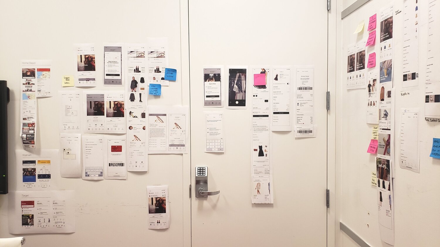
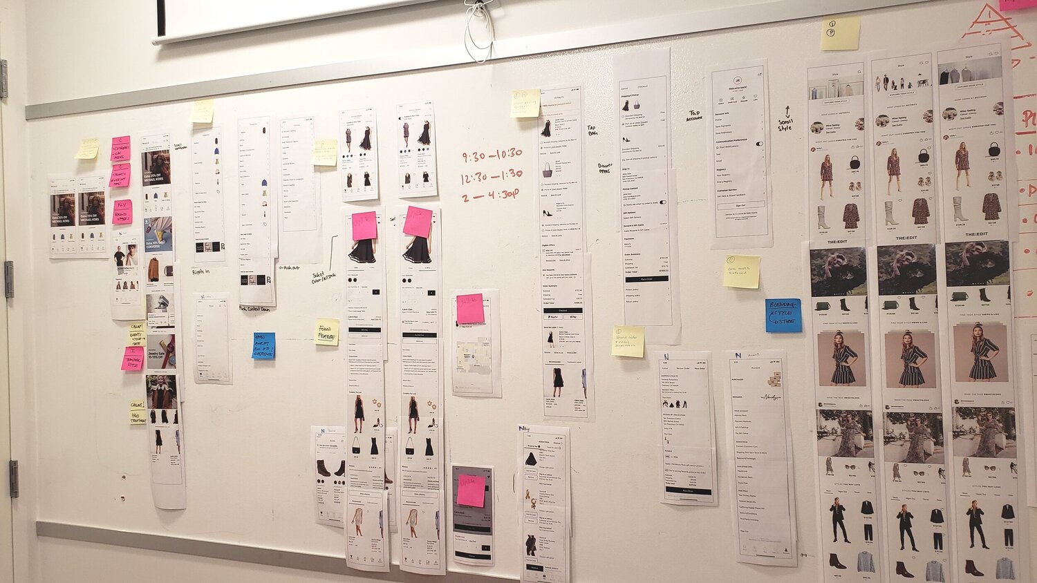
I created “competition killers” where I took competitor apps, designed a copy of it but with Macy’s content, then compared that to our current redesign direction to see if there were elements from it that might be incorporated into our own redesign.
It is included coordinating with several other members on the UX team who were leading redesign efforts for other areas of the app. To ensure our redesigns stayed consistent throughout the app, we set up a war room where we’d regularly meet and share our design’s progress.


“I like being able to edit sizing and color in different steps of the check out process, including the shipping option for each item” — Aylin
“I like the Bold Fonts to highlight the main details because I don’t even like to scroll down sometimes, I just want to see what I need to see and check out” - Tiara
“I like that the eligible offer Star money is in your face because often times I forgot that I even have a coupon until after check out and I am too lazy to cancel the order to do it all over again.” — Khadijah
Provide Tab to differentiate item in “Bag” and item in “Save for later”
Provide quantity adjustment
Easier apply promo code functionality
Keep offering recommend items
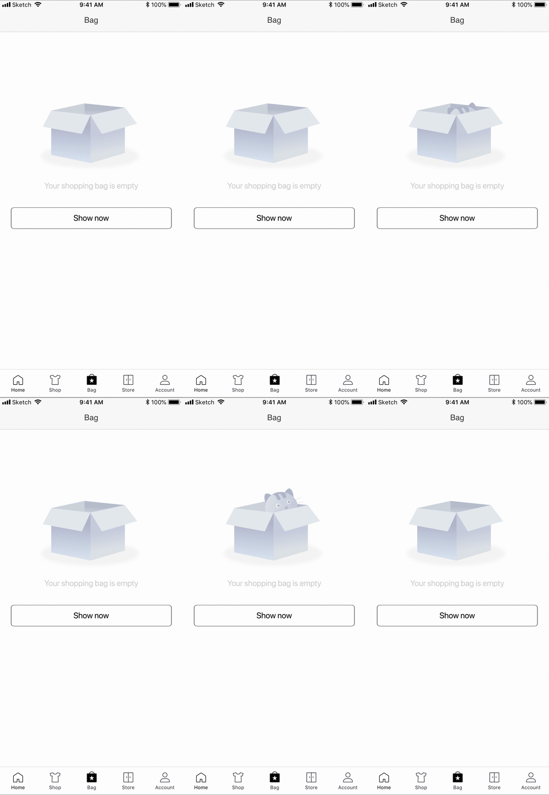
Empty States are the way to improve the user experience of your product, from on boarding to encouraging users to interact with your app.
To present an interesting UX opportunity to help our customers achieve that and guide them to take action.
