MY ROLE
Visual /Interaction designer
Visual /Interaction designer
Interaction Designer, Product Manager, Engineers(US, Taiwan), Scientist
2018
Due to people has disabling hearing loss increasing every year. Communication would be hard for them to communicate with others on a daily basis.
We believe in the power of technology to help break down barriers and make life a little easier for everyone.

Based on the World Health Organization, around 466 million people worldwide have disabling hearing loss. It is estimated that by 2050 over 900 million people will have disabling hearing loss.
Creata an app that can automatically transcript in near real-time allowing Deaf and Hard-of-Hearing communicate in the situation they find it difficult.
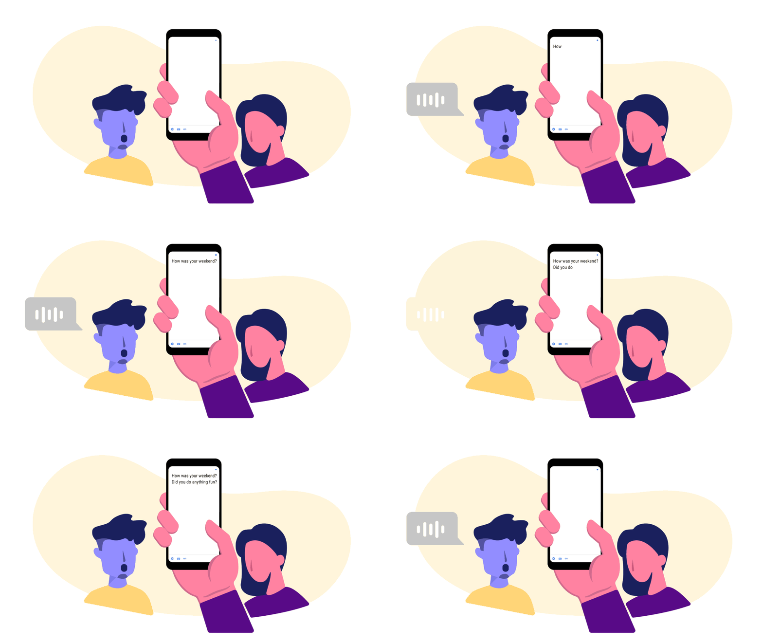
I was involved with the overall UX strategy along with helping develop the visual design and motion UX design. Collaborating with oversea engineers and traveled to Taiwan twice.
Voice volume is important to express emotion during the conversation. It is definitely harder for Deaf and Hard-fo-Hearing people to understand it. Having a volume indicator helps the community better communicate with anyone at any place.
Create a readable and easy visualize graphically to help people process voice volume.
Think out side the box
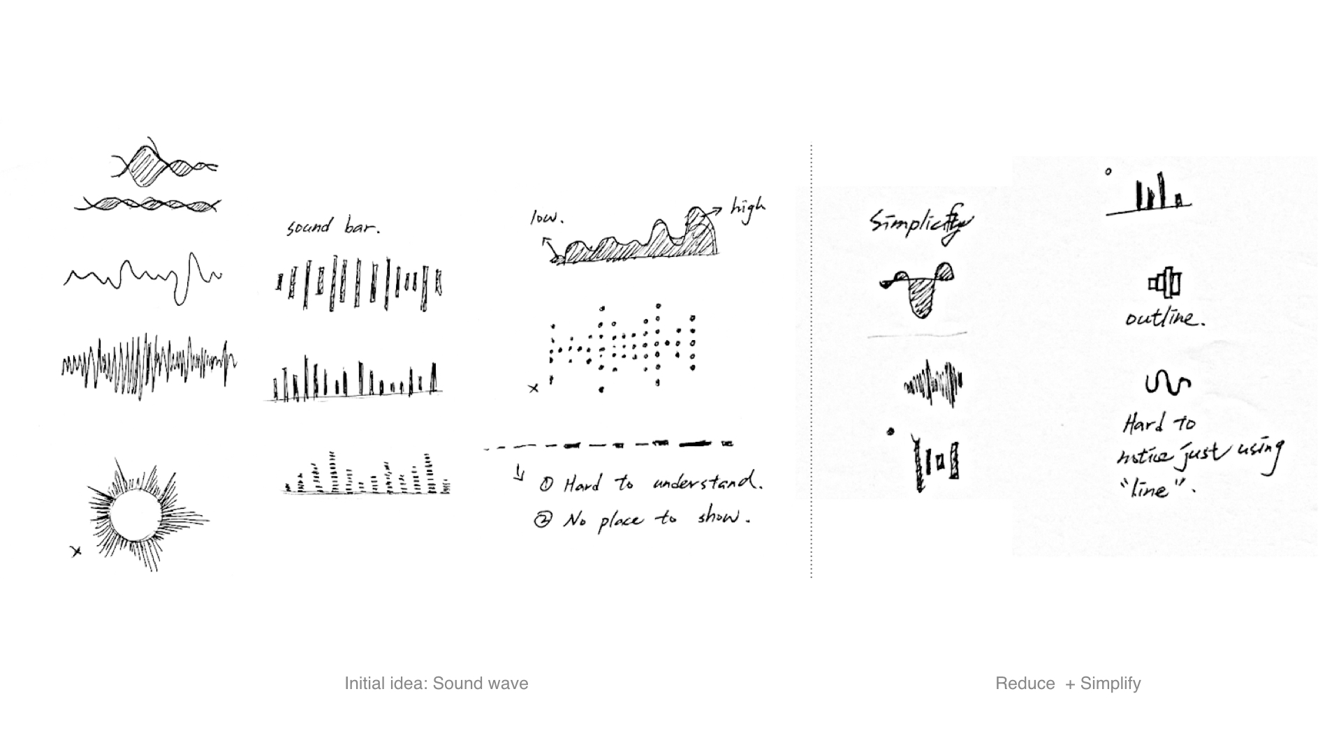
Hand sketching for any associate with sound wave, and tried to simplify it.
The shape is too complicated, and long learning curve for user to understand the indicator.
Keep it simple and align with Google voice search
The learing curve is short for users.
Share the same pattern with Google voice search and it will not too distracting user when they are reading the transcribe.
Made the quick motion prototype to discuss with PM, Machine Learning engineer, and interaction designer.
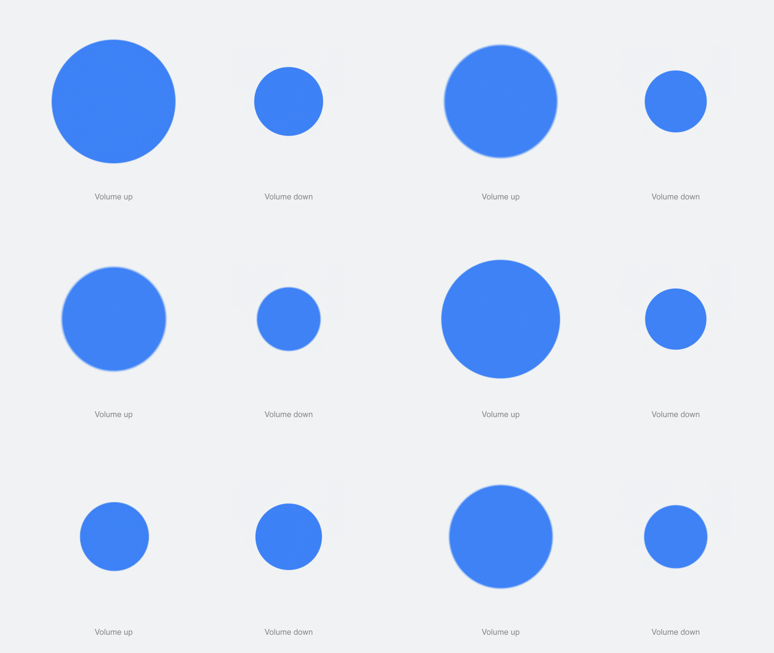
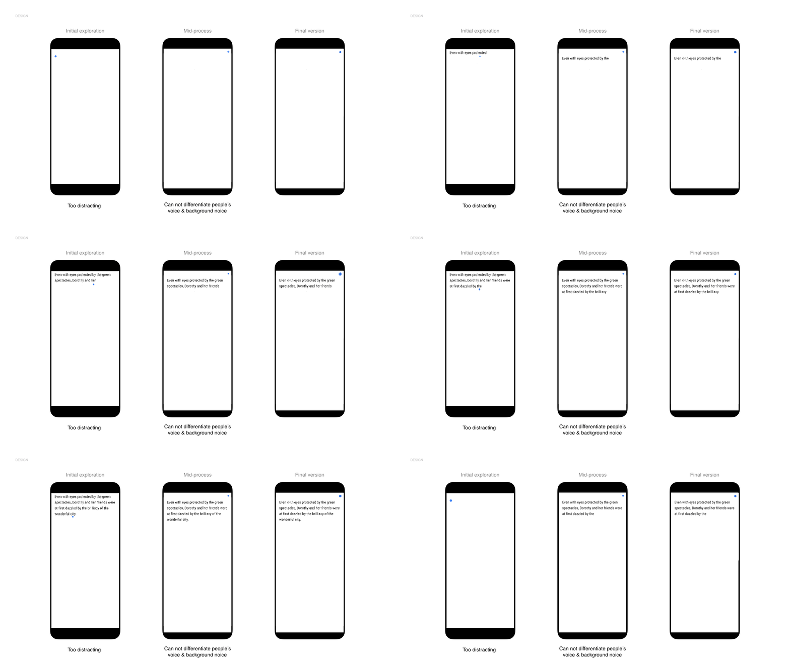
I created prototyping video to demonstrate the real behavior, after
rapid testing with people, and the feedback comes back to me is:
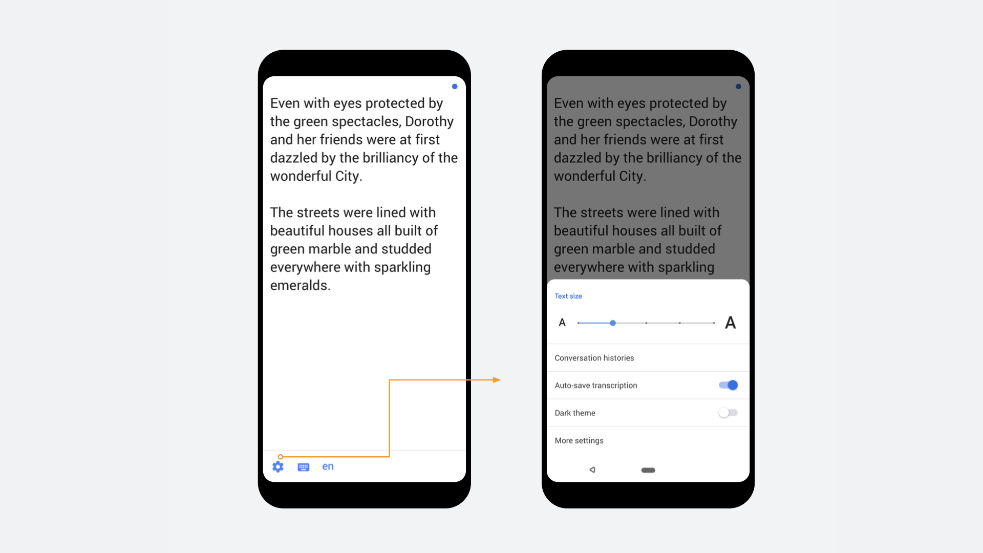
The idea is to provide diverse and useful controls to help users easily change during their daily conversion usage. we partnered with Gallaudet University, a premier school for the deaf and hard of hearing, to make sure everything would cover all they need.
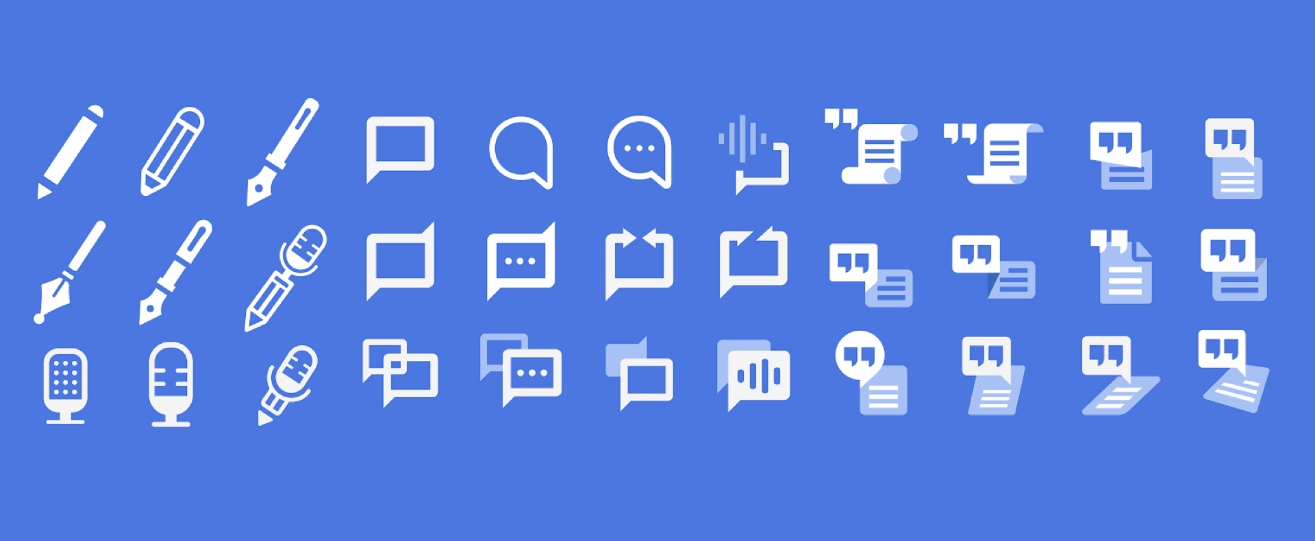
Harmonious fit among other accessibility setting icons while clearly expressed the product
